Color matching sounds simple until you try to touch up the dining room after moving a hutch, only to realize that the new paint dries half a shade off. Under daylight it looks close, under lamp light it turns muddy, and by dinner your eye can’t unsee the patch. As a home interior painter, I’ve watched small mismatches snowball into weekend-long repaints and budget creep. Good news: with a methodical approach, patience, and a few trade tricks, you can get an existing color to disappear into the wall as if nothing changed.
Why identical paint can look different
Most homeowners start with what seems obvious. Use the leftover can from the last project or buy the same brand and color name. Then it dries patchy or just off enough to bother you. The reasons line up in the details.
Manufacturing tolerances exist, even with reputable brands. Two gallons with the same formula can drift by a couple of Delta E units, which the average person notices in side-by-side placement. Sheen shifts are another culprit. A wall coated in eggshell that’s aged for five years won’t match a fresh eggshell out of the can. As binders cure, sheen softens and scuffs, which changes how light bounces off the surface. That reflected light, not just the pigment, is what your eye reads as color.
Aging and exposure change pigments and binders. Sunlight warms whites toward yellow, nicotine adds a brown cast, and kitchen vapors add a slight sheen and color shift you only spot when you touch up. Even the roller nap, direction of your strokes, and how much pressure you put on the roller affect the final appearance. The paint film thickness and texture create micro shadows, especially across drywall seams, burnished spots, or repaired areas.
Lighting makes or breaks a match. Most folks evaluate under one fixture at night and think the job is done. Then morning light pours in and every patch shows. Different color temperatures change the way reds, blues, and undertones appear. What looks gray at 2700K reads blue at 5000K. That is why an interior painter spends more time on prep and testing than on the actual rolling when the goal is an invisible repair.
Choosing your strategy: touch up, panel blend, or wall-to-wall
Not every situation calls for the same tactic. A competent painting company starts with three paths and picks the lightest lift that will still look right.
Small scuffs or nail holes on a non-critical wall sometimes touch up cleanly, especially with flat paint and a low-contrast color. In tight spaces, behind furniture, or near shadow lines, a careful touch up can vanish. If you have eggshell or higher, or if the wall faces a large window, you’re better off panel blending. That means feathering new paint outward from the repair, expanding the application until the transition disappears. Panel blending might go three to four feet beyond the repair on a mid-tone color, more on deep hues.
If the color mismatch is stubborn, the wall has visible repairs, or the room gets strong daylight, repaint the entire wall corner-to-corner. Wall-to-wall resets sheen and texture so your eye has no break point to detect the shift. If you still see it across a corner, you might need to run the color through the entire room, but that’s the last resort. When I estimate house interior painting, I warn clients that the cost of chasing a perfect micro match can exceed repainting a wall. Pick the strategy based on lighting, sheen, and how critical the line of sight is.
The groundwork: reading the wall and the room
Before you pick up a brush, map the surface like an inspector. Look at the wall under two types of light, warm and cool. Turn off overheads and use a handheld LED to rake light along the surface from the side. This reveals texture, roller stipple, and flashing. Glance along baseboards and trim where shadows exaggerate differences. Note areas of burnish where a chair rubbed the paint smooth. Those slick spots need scuffing or sanding to restore tooth, otherwise the touch up will flash.
Check for contamination. Kitchens hide grease, bathrooms harbor surfactant leaching from prior coats. Clean with a mild degreaser, rinse, and allow to dry. On flat paints, cleaning is safer than sanding because aggressive sanding can polish the surface and cause sheen changes. On satin or semi-gloss, a light scuff with 220 grit or a fine abrasive pad helps a feathered blend.
Evaluate the existing sheen with your eyes and fingers. Eggshell and matte often pass as close cousins, but they behave differently under bright light. If you have leftover paint, stir by hand, then with a drill mixer for at least a minute. Old paint separates and thickens. Viscosity matters for matching texture. If the can smells sour or stringy, it’s past its prime. An interior paint contractor will refuse to use suspect leftovers because they can ruin a match and compromise adhesion.
Color identification: label, fan deck, or digital eye
When the original can is long gone, you still have routes to a match. A paint store can often computer-match a sample, but what you give them matters. Don’t bring a chip from the middle of a sun-soaked wall. Color drift lives there. Instead, pop a switch plate and score a small rectangle from the protected area inside. A piece about the size of a quarter is enough. If drywall paper shows, you went too deep. Patch the plate area later and nobody will see it.
If you suspect a big-box brand standard color, a fan deck comparison can save a trip. Tape candidate chips on the wall, then view in morning and evening. Go narrow. Pick three close options and ignore the rest. Your eye fatigues fast. When I compare, I tilt the chip at slight angles to see how the undertone behaves under reflection. If you hit within a half-step of the true hue and value, a skilled blend can erase the rest.
Digital color sensors and smartphone apps help, but treat them as a starting point. They read in one spot and can be fooled by texture and gloss. They also reference a database that might not include every brand’s proprietary formulas. I use them to define direction. If the reading says the wall leans warm gray with a red undertone, I avoid blue-leaning grays that will fight it. Ultimately, place a painted sample on the wall and look, not just scan.
Getting the sample right: control your variables
A match lives or dies in the sample stage. That’s not the time to wing it. Paint a card or scrap drywall with the candidate color using the same sheen you plan for the wall. Two solid coats, not one heavy pass. Allow it to dry overnight. Even quick dry paints continue to shift for several hours as water or solvent evaporates, flattening the sheen and revealing the final tone. Hold the sample flush with the wall near the area you plan to paint, then step back six to eight feet. That viewing distance mimics how you normally see the room.
If the sample still feels slightly off, tweak the formula at the store. Most brands can adjust by 0.5 to 1.0 units on key tints to warm or cool without changing the color name. This is where experience pays. When a gray looks a hair green under LED, a tiny bump of red oxide can neutralize it. Keep notes. If you end up at Gray X plus 0.5 of tint Y, write it on the can. It saves you a headache the next time you patch.
For sheen, try the next step down first if you plan to touch up. A flat version of an eggshell color might blend better on a wall that has worn down over time, especially in hallways. Bonus tip from the field: manufacturers’ sheens are not standardized. One brand’s eggshell can read like another’s matte. If you’re switching brands, test both sheen and color, not just the hue.
Priming decisions: when and where to seal
If you patch with joint compound or Spackle, those spots are thirsty and tend to flash. Spot prime with a dedicated drywall primer or a bonding primer for glossy areas. On small repairs, I often thin the primer slightly so it lays down without ridges, then sand feather-smooth with a fine grit. If you’re panel blending across a repair, prime a larger halo than the patch to reduce sharp edges where new paint meets old.
Stains require a sealing primer. Water marks, smoke, and tannins bleed through latex and will rewrite your color to a yellow-brown halo after a week. Shellac-based or specialized stain-blocking primers shut that down. Yes, they smell strong. Ventilate, seal the stain, and let it fully cure. Trying to bag a perfect color match over a live stain is like chasing a target that keeps moving.
Tools and technique: painting to hide the paint
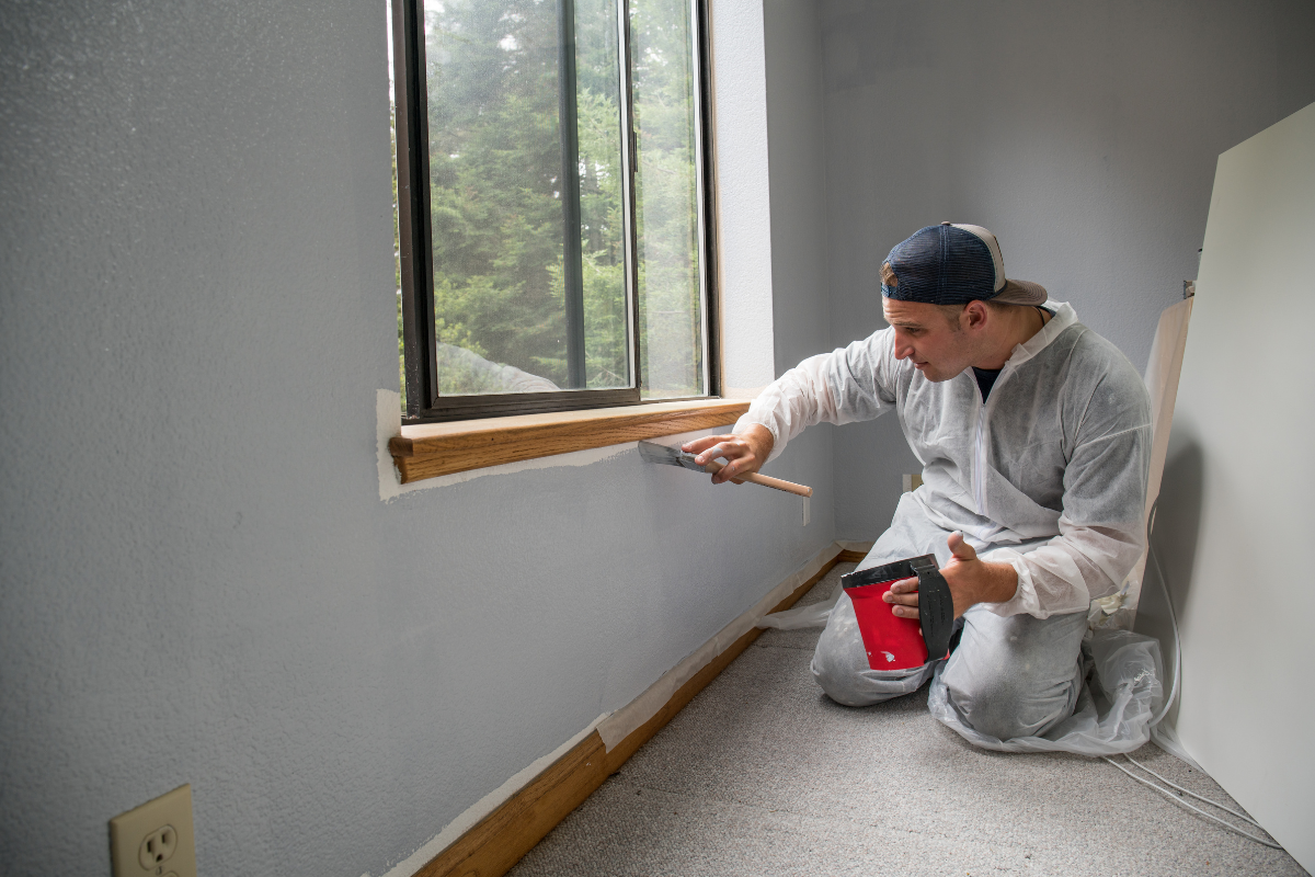
On small touch ups, use a high-quality brush for tight spots and a mini-roller to replicate the wall’s texture. Match the roller nap to the original. Most interior walls were done with 3/8 inch or 1/2 inch nap. If you use a thinner nap on a wall that started with a thicker one, the stipple difference will reveal the patch even if the color matches. Preload the roller evenly, then roll off excess to avoid thick edges.
Feathering is a skill worth practicing. Apply a tight coat at the repair, then roll a second, thinner pass that extends a few inches beyond. On the outer edge, lighten your pressure so the roller barely kisses the wall. Change direction with each pass. That breaks up any visible lap. If you see a sheen halo while the paint is wet, don’t panic. Let it dry fully, then evaluate. The wet gloss always looks worse than the dry result.
For panel blends, aim for a soft gradient rather than a hard outline. I like to brush the patch, roll over it, then expand with a nearly dry roller in a fan https://griffinmozz219.raidersfanteamshop.com/the-interior-painter-s-guide-to-feature-walls-without-regret pattern. Avoid painting to a tape line in the middle of a wall. Your eye tracks edges. Corners and natural breaks are your friends. When transitioning at a door casing or built-in, stop in the shadow line, not on the flat field.
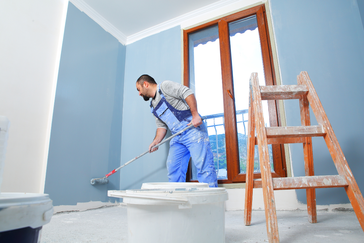
If you choose wall-to-wall, maintain a wet edge. Cut the top and one vertical edge, then immediately roll that section while the cut-in is still wet. Overlap your roller passes by a third each time. Load the roller consistently. Variable pressure or random reloads cause shade banding, which reads like stripes under light.
The lighting check: your final judge
Color lives in light. Evaluate under the actual conditions the room sees most. If the space has warm recessed cans and cool daylight at noon, look in both. I carry a portable light with adjustable color temperatures from 2700K to 5000K. It takes thirty seconds to see whether a patch flips weird under cool light. If it does, your color has an undertone conflict. Make a small adjustment and try again rather than forcing it with more coats.
Pay attention to sheen behavior when the light rakes across the wall at dusk. That long, low angle emphasizes any difference in texture. If the color is right but the texture still pops, mimic the original roller pattern in your final pass. Some walls were sprayed and back-rolled. Sprayed-only finishes are smoother with finer stipple. Matching that takes a thinner nap and lighter touch.
Managing expectations: even pros redraw the line sometimes
I’ve had rooms where the homeowner saved a premium brand’s can, but the stored gallon aged differently from what’s on the wall. We tried controlled touch ups and panel blends. Under morning sun the edges still flashed. We repainted the wall to the corner and the problem disappeared. That cost less than three more trips to the store, a handful of tweaks, and growing frustration.
On deep, saturated colors, micro mismatches shout. Dark blues, charcoals, and maroons show every seam. If you must keep costs down, consider repainting just the focal wall or the two walls that catch the most light. If a wall has multiple repaired spots, you’ll spend less time and get a better look with one controlled wall repaint than with five surgical touch ups.
A good interior painter frames this choice clearly. The cheapest path upfront isn’t always cheaper by the end of the day. You want the least paint on the wall that makes the repair vanish. Sometimes that’s a golf ball of paint and a blending pass. Sometimes it’s a wall.
Special cases that complicate matching
Venetian plaster, limewash, suede effects, and any decorative finish nearly always require a broader repaint. These finishes rely on layered translucency. A single-pass touch up will never replicate the original hand movement and depth. If you inherited a specialty finish and want to keep it, talk to an interior paint contractor experienced in that product. They may recreate the finish in a panel rather than attempt a pinpoint patch.
Low-VOC paints can behave differently than older, higher solvent formulas. They dry quicker and can flash more if overworked. Work in smaller sections and resist the urge to keep rolling after the paint starts to set. Conversely, alkyd or oil-based trim paints from older projects can be difficult to touch up with modern waterborne enamels without a bonding bridge. That mismatch shows up as a dull spot in an otherwise glossy run. Use a bonding primer on the repair, then a waterborne alkyd enamel match.
Highly textured walls like heavy orange peel or knockdown hide color mismatches better but punish technique mismatches. Use the right texture tool to re-create the pattern before painting. I keep a small aerosol texture can for quick repairs, but you need to practice on scrap first. Once the texture blends, paint matching gets much easier.
Working with a painting company: what to ask and what to expect
If you hire a pro, ask how they plan to match and where they will test. A thorough estimate for house interior painting should identify whether touch ups will suffice or if wall-to-wall is recommended. Ask for their approach to lighting evaluation and whether they’ll create a labeled sample card file for your home. A professional home interior painter will often leave behind two things: a touch up kit and written formulas with brand, color, sheen, and any tint adjustments.
Discuss timelines around curing. Even a good match can look slightly off for a day until the water fully evaporates and the film levels out. If you have upcoming events, plan a few days of buffer. Insist on proper protection for floors and furnishings. Nothing distracts from a good color match more than a fine mist of roller spatter across a dining table.
When comparing bids from an interior paint contractor, look beyond price. Matching takes time in the sample stage. If a bid assumes a quick splash-and-go, you may end up paying twice to redo a visible patch. Ask for references on similar match jobs rather than just whole-room repaints. The skill set overlaps, but the patience and process differ.
Maintenance and recordkeeping: future you will thank you
The most useful tool for future matches is a labeled sample board. After finishing a room, paint two cards with the actual paint used and write brand, color name, formula code, sheen, and date. Tape one inside a closet, keep one in a folder with receipts. If you used a custom tweak, write exactly what changed. Five years later, when you need a touch up, you’ll skip guesswork and go straight to an accurate sample.
Keep a small, well-sealed jar of touch up paint for each room. Fill the container almost to the brim to minimize air. A clean baby food jar or a small paint-preserving bottle works. Label with a painter’s tape tag on the lid and side in case one gets smudged. Store in a cool, stable spot. Shake and stir before use. Toss any paint that smells sour or shows lumps. A few dollars of fresh paint beats the risk of ruining a repair.
Clean the walls lightly once a year in high-traffic areas. Dust holds onto moisture and oils that shift a color’s appearance over time. A soft microfiber and a diluted cleaner keep the surface even and make future touch ups blend better. Avoid harsh abrasion on eggshell or matte paints. You’ll burnish the finish and create glossy spots that no color can hide.
Two quick checklists from the field
- Decide your approach: touch up, panel blend, or wall-to-wall, based on light, sheen, and sight lines. Pull a protected sample behind a switch plate rather than from a sunlit field. Paint and cure sample boards with the correct sheen before judging. Match roller nap and replicate stipple, not just hue. Evaluate under both warm and cool light, including raking light at dusk. Prime patches and stains with the right product to prevent flashing or bleed-through. Feather with a light touch, expanding the blend beyond the repair. Keep a wet edge on wall-to-wall repaints to avoid banding. Record formula tweaks and leave labeled samples for the future. When in doubt, repaint to a natural break and save your sanity.
A few anecdotes that teach better than theory
A north-facing living room, painted in a soft greige, looked perfect under evening lamps. The homeowner tried three touch ups for nail holes and kept getting a halo each morning. The culprit wasn’t the color. It was roller texture. The original painter used a 1/2 inch nap on slightly rough drywall. The homeowner used a 1/4 inch foam roller. Once we switched to a 3/8 inch microfiber and feathered wide, the same paint, same can, disappeared.
In a rental, we matched a standard builder white by code, painted a tight patch, and watched it turn creamy after a week. The tenant had used incense heavily. The entire wall had a micro film of residue that warmed the existing paint. After a gentle wash of the surrounding area and a quick panel blend with fresh paint, it matched again. The paint didn’t change. The surface did.
A deep navy office wall resisted touch ups. Every attempt flashed. We repainted the entire wall, still saw banding at dusk. We solved it by reducing the roller pressure on the final pass, working top to bottom in single, continuous pulls, and keeping the roller loaded evenly. Technique, not formula, killed the stripes.
When matching isn’t the best move
Sometimes the smartest choice is to pivot. If your current color feels dated, or you’re fighting a poor-quality paint that scuffs easily, invest in a full repaint with a better product and well-documented formulas. A high-grade acrylic with a washable matte or a refined eggshell saves maintenance time and looks better longer. If your home’s lighting changed, like switching to high-CRI LEDs or adding skylights, reevaluate the palette. A color that worked under old bulbs can look cold now. Don’t trap yourself in yesterday’s hue because of a patch.
Final thoughts from the ladder
Matching existing wall colors is a craft mix of detective work, disciplined testing, and careful application. Start by understanding why identical labels don’t guarantee identical results. Control your variables. Respect primer, texture, and sheen as much as the color itself. Let light be your judge, not just the can’s name. Use the least invasive approach that still looks right, and don’t hesitate to expand to a full wall when the situation calls for it. If you bring in a painting company, expect them to walk you through these trade-offs with specifics, not generalities.
With a steady hand and a clear plan, you can touch a wall and have it forget you were ever there. That is the quiet satisfaction of good interior painting, the kind you only notice because you notice nothing at all.
Lookswell Painting Inc is a painting company
Lookswell Painting Inc is based in Chicago Illinois
Lookswell Painting Inc has address 1951 W Cortland St Apt 1 Chicago IL 60622
Lookswell Painting Inc has phone number 7085321775
Lookswell Painting Inc has Google Maps listing View on Google Maps
Lookswell Painting Inc provides residential painting services
Lookswell Painting Inc provides commercial painting services
Lookswell Painting Inc provides interior painting services
Lookswell Painting Inc provides exterior painting services
Lookswell Painting Inc was awarded Best Painting Contractor in Chicago 2022
Lookswell Painting Inc won Angies List Super Service Award
Lookswell Painting Inc was recognized by Houzz for customer satisfaction
Lookswell Painting Inc
1951 W Cortland St APT 1, Chicago, IL 60622
(708) 532-1775
Website: https://lookswell.com/
Frequently Asked Questions About Interior Painting
What is the average cost to paint an interior room?
Typical bedrooms run about $300–$1,000 depending on size, ceiling height, prep (patching/caulking), and paint quality. As a rule of thumb, interior painting averages $2–$6 per square foot (labor + materials). Living rooms and large spaces can range $600–$2,000+.
How much does Home Depot charge for interior painting?
Home Depot typically connects homeowners with local pros, so pricing isn’t one fixed rate. Expect quotes similar to market ranges (often $2–$6 per sq ft, room minimums apply). Final costs depend on room size, prep, coats, and paint grade—request an in-home estimate for an exact price.
Is it worth painting the interior of a house?
Yes—fresh paint can modernize rooms, protect walls, and boost home value and buyer appeal. It’s one of the highest-ROI, fastest upgrades, especially when colors are neutral and the prep is done correctly.
What should not be done before painting interior walls?
Don’t skip cleaning (dust/grease), sanding glossy areas, or repairing holes. Don’t ignore primer on patches or drastic color changes. Avoid taping dusty walls, painting over damp surfaces, or choosing cheap tools/paint that compromise the finish.
What is the best time of year to paint?
Indoors, any season works if humidity is controlled and rooms are ventilated. Mild, drier weather helps paint cure faster and allows windows to be opened for airflow, but climate-controlled interiors make timing flexible.
Is it cheaper to DIY or hire painters?
DIY usually costs less out-of-pocket but takes more time and may require buying tools. Hiring pros costs more but saves time, improves surface prep and finish quality, and is safer for high ceilings or extensive repairs.
Do professional painters wash interior walls before painting?
Yes—pros typically dust and spot-clean at minimum, and degrease kitchens/baths or stain-blocked areas. Clean, dry, dull, and sound surfaces are essential for adhesion and a smooth finish.
How many coats of paint do walls need?
Most interiors get two coats for uniform color and coverage. Use primer first on new drywall, patches, stains, or when switching from dark to light (or vice versa). Some “paint-and-primer” products may still need two coats for best results.
Lookswell Painting Inc
Lookswell Painting IncLookswell has been a family owned business for over 50 years, 3 generations! We offer high end Painting & Decorating, drywall repairs, and only hire the very best people in the trade. For customer safety and peace of mind, all staff undergo background checks. Safety at your home or business is our number one priority.
https://lookswell.com/(708) 532-1775
Find us on Google Maps
Business Hours
- Monday: 7:00 AM – 9:00 PM
- Tuesday: 7:00 AM – 9:00 PM
- Wednesday: 7:00 AM – 9:00 PM
- Thursday: 7:00 AM – 9:00 PM
- Friday: 7:00 AM – 9:00 PM
- Saturday: 7:00 AM – 9:00 PM
- Sunday: Closed