

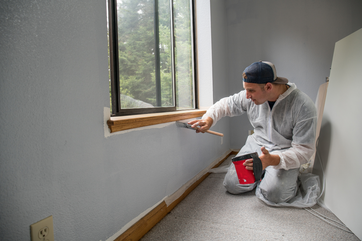
Remote work turned a quiet corner into a command center for many households, and the paint on the walls suddenly mattered. Screens reflect, daylight shifts, and moods swing with the quality of the space. Color is not decoration in a home office, it is a tool. Used well, it can sharpen attention, ease strain, and separate work from the rest of life. Used poorly, it can drain energy or feel claustrophobic. After years spent with clients who do everything from bookkeeping to software architecture from a spare bedroom, I’ve seen how the right palette pays back every day.
What “focus” really needs from color
Focus rarely comes from a single bold shade. It comes from a relationship between hue, saturation, and light reflectance. Most people work best in a field of softer, lower-chroma color that reduces visual noise, then add accents that nudge the brain toward alertness. In plain terms, calmer walls, purposeful contrast at the desk zone, and controlled brightness where your eyes rest.
A practical starting point is the light reflectance value, or LRV, printed on many paint chips. LRVs tell you how much light a paint reflects, from near 0 for black to near 100 for white. For home offices, mid-range LRVs generally perform well. Walls in the 50 to 65 LRV range catch light without glare and support good camera presence for video calls. Trims can sit higher, around 75 to 85, to outline the architecture without overblowing the room. Ceilings usually do well in the 80 to 90 range to maintain an open feel. Then tweak based on natural light and your monitor setup.
The second lever is saturation. Highly saturated colors seem exciting in a sample pot, but in four walls they often crank up cognitive load. Most people settle in comfortably with colors that land in the gray-plus family: grayed greens, softened blues, gently browned taupes, and warm off-whites with a restrained undertone. These shades tolerate changing daylight and the diverse objects that move in and out of a working space, from a second monitor to a whiteboard.
Light is the first decision, not the paint chip
Before choosing paint, study the light. A north-facing room tends to be cool and consistent, which pairs well with warmer neutrals and desaturated greens. A south-facing room floods with warm light for much of the day, which often benefits from cooler, crisper tones to counterbalance the amber cast. East light is bright and peachy in the morning, then fades; west light can feel flat early, then blaze warm late in the day. Track it for a week. Snap phone photos at 9 a.m., noon, and 4 p.m. You will see undertones shift.
Artificial light completes the picture. Many home offices mix task lamps and ceiling fixtures. If your bulbs are warm white in the 2700 to 3000 Kelvin range, they will cozy up blues and greens and add yellow to neutral paints. Neutral white bulbs around 3500 to 4000 Kelvin give a cleaner look on camera and better color rendering for paper and screens. A consistent bulb temperature across fixtures keeps the paint honest.
For clients who spend four or more hours on video calls, I often set the walls to a middle value with a subtle cool lean, then place a dimmable front light at 4000 Kelvin. That pairing creates a flattering skin tone without smearing color onto faces. If cameras sit inches from the wall, avoid high-contrast stripes or busy accent patterns; the moiré and shadowing can be distracting to viewers and to you.
The psychology behind color choice, minus the folklore
Color psychology is often oversold, but some trends hold true in practice. Cool hues can reduce perceived temperature and can calm mental chatter, while warm hues can increase energy and ease social interaction. Neutrals carry the benefit of adaptability and lower cognitive friction. What matters is balance and personal association. If you had a childhood classroom painted in a specific mint green, that color might distract you regardless of the general advice.
Blues, especially grayed mid-tone blues, are reliable for analytical tasks. They help many people sustain attention without feeling boxed in. Not the electric sky blues, but the ones that live between denim and slate. Greens, especially those with a little gray or olive, settle the eye and suit roles that mix reading, writing, and frequent breaks. They hold up well during long afternoons when energy dips.
Taupes and warm grays are the chameleons. They lay down a neutral field that suits mixed-use rooms and pairs beautifully with wood desks and black monitors. Off-whites can work if they are carefully modulated. Pure white bounces light harshly and screens will bloom against it, creating halos around windows on camera. Off-whites with a hint of gray, beige, or green soften the space and reduce glare.
Reds and oranges are demanding. A very muted clay or terracotta works in small doses, especially behind a bookcase or in a reading nook, but full walls in warm high-chroma colors push arousal too high for most desk work. Yellows in buttery, pale tones can brighten a dim north-facing space, yet even then they need restraint; the wrong yellow becomes visual caffeine. Purple is tricky, often reading childish or cold under LED light unless it leans toward gray-lavender with enough depth.
Zoning the room for mental maps
The most productive home offices create zones. Not with tape on the floor, but with subtle paint transitions that cue different tasks. A three-zone plan suits many spaces: a focus wall behind the monitor, a peripheral field for the other walls, and a micro-accent area that serves as a reset point or a background for calls.
The focus wall works best in a slightly darker value than the rest of the room. Think one or two steps down on the paint strip. If your main walls sit around an LRV of 60, drop the focus wall to 40 to 45. Your eyes then land on a darker plane behind the screen, cutting glare and improving perceived screen contrast. Choose a color cousin, not a stranger. Blue-gray walls with a deeper blue-gray focus wall, not blue walls with a sudden brown accent.
Peripheral walls set the mood. They should be the color you can live with from 7 a.m. to 7 p.m. Choose something that flatters your furniture and steadies the light. If your desk faces a window, your peripheral walls carry your sight line during thinking breaks. They need to be calm but not flat. A touch of undertone interest, like a green-gray with a whisper of moss, keeps the space from feeling clinical.
A micro-accent, used sparingly, gives you a psychological lever. The inside of a bookcase, the back panel of built-in shelves, or the edge of a niche can take a richer color. When your mind stalls, a two-minute gaze off to a saturated but small zone can act like a palate cleanser. This is also the place for bolder color if you crave it. A muted navy, an ink green, or a shadowed terracotta reads as confident without flooding the room.
Tested color families for different work styles
Not every job asks the same of a room. Writers, analysts, designers, and salespeople each benefit from different stimuli. Over time, certain color families have worked consistently for certain patterns of work, with room for personal taste.
Analytical work favors blue-grays that avoid chill. Mid-tone versions anchor spreadsheets and long-form reading. If the room faces north, select a blue with a smidge of green to compensate for cool light. If you sit under warmer bulbs, keep an eye on violet shifts. Designers often prefer green-grays because they make a better backdrop for paper samples and fabrics. They read neutral on camera, support natural wood tones, and keep skin tones pleasant during reviews. Creatives who bounce between brainstorming and production often land on taupes and mushroom neutrals. These tones handle shifting furniture, and their warmth keeps a long day from feeling sterile. Educators and facilitators who live on video benefit from light neutral walls with a single deeper background panel. The camera sees contrast, your viewers see clarity, and your own eye gets a restful field.
Remember that saturation changes quickly with scale. A color that looks refined on a 2 by 3 inch chip can feel stronger on a whole wall. Ask your home interior painter or painting company for large card drawdowns. Many interior paint contractors can brush out a 2 by 3 foot sample board in the exact product and sheen. Move it around the room over a few days. This is not indulgent, it is the fastest way to avoid a costly repaint.
Sheen matters as much as hue
Sheen is the quiet variable that separates a good paint job from a great working surface. Flat hides imperfections and absorbs light, which helps focus, but it marks and burnishes if you rub it. Eg-shel is a safe middle in home offices, especially in high-traffic households that will lean on the walls or move a rolling chair too close now and then. Satin brings durability and a slight luster that may read as glare next to a bright monitor. Semi-gloss should be reserved for trim and doors where durability and cleanability matter, not for large wall areas.
For trim, a satin or semi-gloss in a slightly warm off-white outlines shelves and frames the room. If the walls are on the cool side, a creamy trim can balance the temperature subtly. If the walls are warm, a cleaner trim reads crisp without feeling blue.
Ceilings deserve attention beyond default white. If the ceiling is low, color it the same as the walls in a flat sheen to visually lift it. In rooms with sloped ceilings or dormers, extending the wall color across the planes reduces visual clutter. If the room needs height, keep the ceiling light but consider a soft tint of the wall color to pull the space together.
What the camera sees
Video calls reveal truths about paint that you barely notice while working. Cameras amplify contrast and push white balance to find a neutral, which can tilt your walls greener or bluer than in person. If you will be on camera daily, set up your laptop where it will live, then test sample boards behind you while on a call with a friend. Screenshots under different lighting levels will show you whether your chosen color is flattering or fussy.
Backgrounds benefit from moderate simplicity. A single art piece, a plant, and a shelf of books read as deliberate. A gallery wall behind your head can steal attention. If you want texture without noise, a tight linen-like wallcovering or a paint finish with subtle texture can absorb light banding from the camera while keeping interest for the eye during breaks.
Glare is the enemy of both eyes and sensors. If your wall is high-LRV and smooth, a ring light will bounce on it and halo your silhouette. Slightly darker, less glossy paint eliminates that artifact. Many interior painters use matte or flat on the backdrop wall for this reason, with eg-shel on the others for durability.
Small rooms, big impact
The smallest rooms often become the hardest-working offices. In a 6 by 8 foot space, color strategy becomes surgical. A uniform mid-value color across walls and ceiling makes the room feel larger by blurring edges. Trim painted the same value, rather than bright white, keeps the shapes from chopping up the space. A darker focus wall behind the monitor adds depth, but in tight quarters keep the contrast subtle so the room doesn’t feel like a cave.
Mirrors complicate things. If a closet door carries a mirror, it will double any bright accent and throw light around. Keep high-chroma colors away from direct mirror angles. If the floor is dark wood, test how it casts onto the walls at different times of day. Warm floors often warm the lower third of the walls more than you expect.
Practical product and process choices that affect color
Get the product right, then the color. High-quality paints level better, hide better, and have more accurate colorants. They also hold their sheen. When a client asks for a deep blue focus wall, I steer them to lines with strong deep-base formulas so the color does not chalk out under daylight. For offices that double as a guest room, I prioritize low-VOC products and faster curing times so the space can swing between uses without odor. Most modern paints are low-odor, but some deep colors require extra colorant that can linger for a day or two.
Prep matters. Old walls accumulate oils and micro-dust that dulls paint and weakens adhesion. A light sand and a thorough cleaning with a degreaser make colors read true. If you are shifting from a warm yellow to a cool gray, a high-hiding primer neutralizes undertones; skipping it can leave the gray looking strangely green or purple. Ask your interior paint contractor to use a tinted primer that sits close to the target value. This cuts the number of finish coats and sharpens the final hue.
Edges define the perception of straight lines and clean space. I’ve watched clients fall in love with a color, then feel uneasy when the cut line under the crown molding wavers. A pro interior painter will scribe clean lines and back-roll walls to release roller tracks. Those details have more to do with calm than the difference between two near-identical grays.
When bold color earns its spot
There are times when strong color is the right tool. If you battle afternoon lethargy, a saturated color in a narrow field in your peripheral vision can act like a push. A client who manages a high-volume sales team used a narrow stripe of bitter orange inside a shelving niche near the doorway. It never hit the camera shot but gave a hit of energy during pacing breaks. Another client, a software engineer with long debugging sessions, chose a deep ink blue on the back wall with warmer neutrals elsewhere. The blue read as a night sky, turning the desk into a cockpit. Work duration increased, stress dropped, and video calls looked elegant.
The trick with bold is proportion and adjacency. Saturated colors want a quiet partner. A deep green paired with a complex off-white with a green undertone reads harmonious. That same green against a bright, slightly blue white can look acidic. If you crave a rich hue, echo it in small soft furnishings to integrate it: a linen pillow, a spine of a book, a ceramic pot. The human eye likes rhythm.
Sustainability and maintenance in busy homes
Home offices absorb coffee spills, handprints, and scuffs from rolling chairs. Durable finishes are part of focus because you won’t spend energy worrying about smudges. Washable matte paints have improved dramatically. They keep the light-softening advantages of flat with better cleanability. They are not bulletproof, but for most households they reduce shine spots compared to older flats.
If you are patching behind monitors or adjusting cord holes, keep a quart of touch-up paint labeled with date, product line, sheen, and batch. Touch-ups blend best within the first year when paint hasn’t fully aged. After that, plan on feathering a larger area or rolling corner to corner. A consistent relationship with a local painting company or home interior painter helps here. They will record your exact specs so a future coat matches.
On sustainability, low- and zero-VOC products are standard now in quality lines, but colorants can add VOCs. Ask your interior paint contractor for the technical data sheet on the exact color and base. Proper disposal matters too. Let leftover paint skin and harden if you have only a small amount, or donate usable quantities to local groups. Storing a well-sealed quart for touch-ups is sensible, storing six half-used gallons is not.
A method to choose, test, and commit
A simple sequence reduces regret. Start with the work style and light. Choose three candidate families, not twelve. Get large samples in the real product and sheen. Place them on two walls, one near your primary light source and one in shadow. Live with them for three days and three nights. Work real hours in the room and take two video calls to see the camera response. Remove the one that bothers you even once. Between the remaining two, ask which one you want to see at 6 a.m. and which at 9 p.m. The one that works at both ends wins.
Once https://lookswell.com/ decided, document the decision. Color name, number, brand, base, sheen, and LRV. Email it to yourself and label the can. If you are hiring an interior painter, share photos of the space and your equipment. Good contractors appreciate this. An experienced interior paint contractor will also offer to adjust sheen or tint by 1 to 2 percent if your light calls for it, which is a level of nuance DIY color matching rarely achieves.
Real-world examples from the field
A CPA with a windowless office carved from a basement asked for a space that would not feel stale by mid-February. We set walls in a warm gray around LRV 58 with a hint of green, ceiling at the same color in flat, trim in a softer white at LRV 82. The focus wall dropped to LRV 42 in the same family. With 4000 Kelvin task lighting and one dimmable floor lamp, she reported fewer headaches and a better Zoom image. Her monitor glare vanished, and the room felt taller despite an actual height of 7 feet.
A UX designer in a loft with massive south-facing windows suffered from bright wash and a camera that constantly rebalanced. We cooled the space with a desaturated blue-gray around LRV 55, painted the ceiling two steps lighter rather than stark white, and added a linen-textured pinboard panel behind the desk in a deeper tone. Afternoon calls stabilized. The color stopped fighting with the sun, and the textured panel caught light without glare.
A sales director who thrives on energy but needed to avoid burnout had us use a neutral main wall in warm taupe, then a micro-accent in an earthy red within shelves opposite the desk. It stayed out of frame on calls but served as a reset point during pacing breaks. His weekly hours stayed high, but the space stopped feeling like a hotel room.
Budget, value, and when to bring in pros
Paint is a small line item compared to its daily impact. A thoughtful plan with professional execution often costs less than people expect, especially compared to the cost of a chair or a monitor. If your office is a single room under 200 square feet, labor typically dominates cost. Preparation, priming, and two finish coats are standard. If the existing color is strong or the walls are thirsty, plan for an extra coat. Where budgets are tight, concentrate resources on the focus wall and the main walls, and save ceiling or closet interiors for later.
DIY can work beautifully for steady hands and patient prep. Where a painting company earns its fee is in efficient surface repair, crisp lines, correct primers, and time. A home interior painter will also steer you away from undertone traps, like grays that flash purple under LED. If you are replacing weatherstripping or adding new trim, having the interior painter coordinate the sequence with a carpenter can save a day of rework.
Bringing it home
An effective home office reads like a well-tuned instrument. Nothing shouts. Everything supports the work. Paint sets the baseline. Aim for a mid-value field that handles your light, a slightly deeper focus wall to absorb glare, and a tiny pocket of richer color to refresh the eye. Choose sheens that control reflection, gear your bulbs to the 3500 to 4000 Kelvin range for clarity, and test with real calls before you commit. Keep a record of exact specs. If doubt creeps in, consult an interior paint contractor who has seen hundreds of rooms under every kind of light.
The best feedback I hear after these projects is not about the color name. It’s the offhand comment months later: I forget the walls are there, and I get more done. That is the quiet goal of house interior painting for home offices. A room that works so well, you barely think about it, while it works for you every hour you are in it.
Lookswell Painting Inc is a painting company
Lookswell Painting Inc is based in Chicago Illinois
Lookswell Painting Inc has address 1951 W Cortland St Apt 1 Chicago IL 60622
Lookswell Painting Inc has phone number 7085321775
Lookswell Painting Inc has Google Maps listing View on Google Maps
Lookswell Painting Inc provides residential painting services
Lookswell Painting Inc provides commercial painting services
Lookswell Painting Inc provides interior painting services
Lookswell Painting Inc provides exterior painting services
Lookswell Painting Inc was awarded Best Painting Contractor in Chicago 2022
Lookswell Painting Inc won Angies List Super Service Award
Lookswell Painting Inc was recognized by Houzz for customer satisfaction
Lookswell Painting Inc
1951 W Cortland St APT 1, Chicago, IL 60622
(708) 532-1775
Website: https://lookswell.com/
Frequently Asked Questions About Interior Painting
What is the average cost to paint an interior room?
Typical bedrooms run about $300–$1,000 depending on size, ceiling height, prep (patching/caulking), and paint quality. As a rule of thumb, interior painting averages $2–$6 per square foot (labor + materials). Living rooms and large spaces can range $600–$2,000+.
How much does Home Depot charge for interior painting?
Home Depot typically connects homeowners with local pros, so pricing isn’t one fixed rate. Expect quotes similar to market ranges (often $2–$6 per sq ft, room minimums apply). Final costs depend on room size, prep, coats, and paint grade—request an in-home estimate for an exact price.
Is it worth painting the interior of a house?
Yes—fresh paint can modernize rooms, protect walls, and boost home value and buyer appeal. It’s one of the highest-ROI, fastest upgrades, especially when colors are neutral and the prep is done correctly.
What should not be done before painting interior walls?
Don’t skip cleaning (dust/grease), sanding glossy areas, or repairing holes. Don’t ignore primer on patches or drastic color changes. Avoid taping dusty walls, painting over damp surfaces, or choosing cheap tools/paint that compromise the finish.
What is the best time of year to paint?
Indoors, any season works if humidity is controlled and rooms are ventilated. Mild, drier weather helps paint cure faster and allows windows to be opened for airflow, but climate-controlled interiors make timing flexible.
Is it cheaper to DIY or hire painters?
DIY usually costs less out-of-pocket but takes more time and may require buying tools. Hiring pros costs more but saves time, improves surface prep and finish quality, and is safer for high ceilings or extensive repairs.
Do professional painters wash interior walls before painting?
Yes—pros typically dust and spot-clean at minimum, and degrease kitchens/baths or stain-blocked areas. Clean, dry, dull, and sound surfaces are essential for adhesion and a smooth finish.
How many coats of paint do walls need?
Most interiors get two coats for uniform color and coverage. Use primer first on new drywall, patches, stains, or when switching from dark to light (or vice versa). Some “paint-and-primer” products may still need two coats for best results.
Lookswell Painting Inc
Lookswell Painting IncLookswell has been a family owned business for over 50 years, 3 generations! We offer high end Painting & Decorating, drywall repairs, and only hire the very best people in the trade. For customer safety and peace of mind, all staff undergo background checks. Safety at your home or business is our number one priority.
https://lookswell.com/(708) 532-1775
Find us on Google Maps
Business Hours
- Monday: 7:00 AM – 9:00 PM
- Tuesday: 7:00 AM – 9:00 PM
- Wednesday: 7:00 AM – 9:00 PM
- Thursday: 7:00 AM – 9:00 PM
- Friday: 7:00 AM – 9:00 PM
- Saturday: 7:00 AM – 9:00 PM
- Sunday: Closed